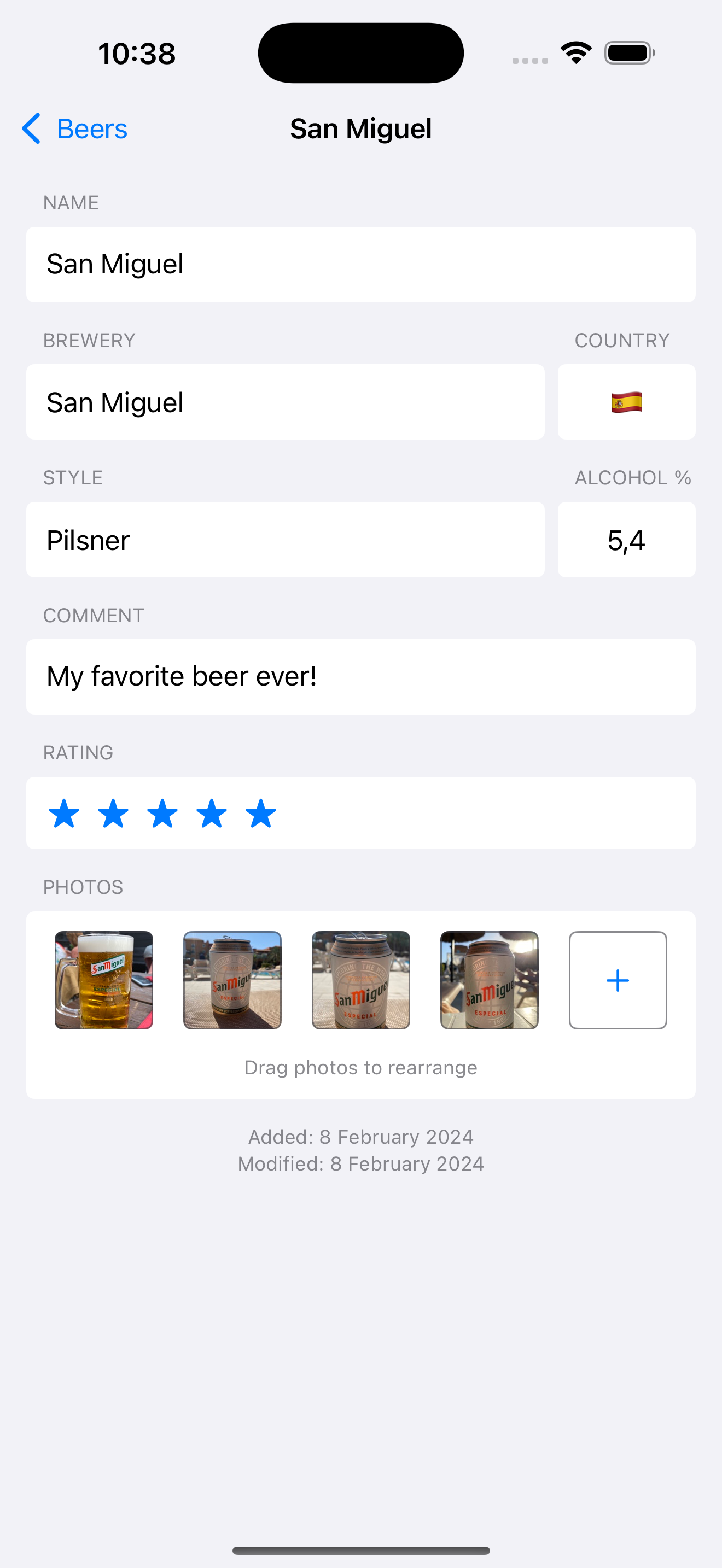
Beer Diary version 2.3.3 released

Version 2.3.3 of the BeerDiary app is now live on the iOS AppStore! It is available for iPhone and iPad and you can download it here.
I would love to receive your feedback. If you have questions or remarks don’t hesitate to send me a message.
New features
New fields
New fields for ‘Country’ and ‘Alcohol percentage’ have been added to the app. The next two paragraphs discuss them in detail.
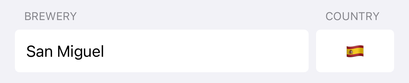
Country
I received user feedback asking if the origin country for each beer could be added to the app. This feature was in the back of my mind for some time already so this was a nice motivation to finally implement it. Next to the Brewery field there is now a new Country field that shows the flag for the chosen country:
If you click the flag, a Country Picker will pop up:

This picker has a number of features:
- The top list consists of countries you have already used at least once in another beer. This allows for quick selection in most cases.
- The bottom list contains all other known countries. If you don’t want to specify a country, just pick ‘Unknown’.
- You can search by 2-letter country code or part of the country name. Search is case insensitive.
A cool additional feature is that you can search country names both by using the display language of the device (in this case English), and the local name for each country in its respective language.
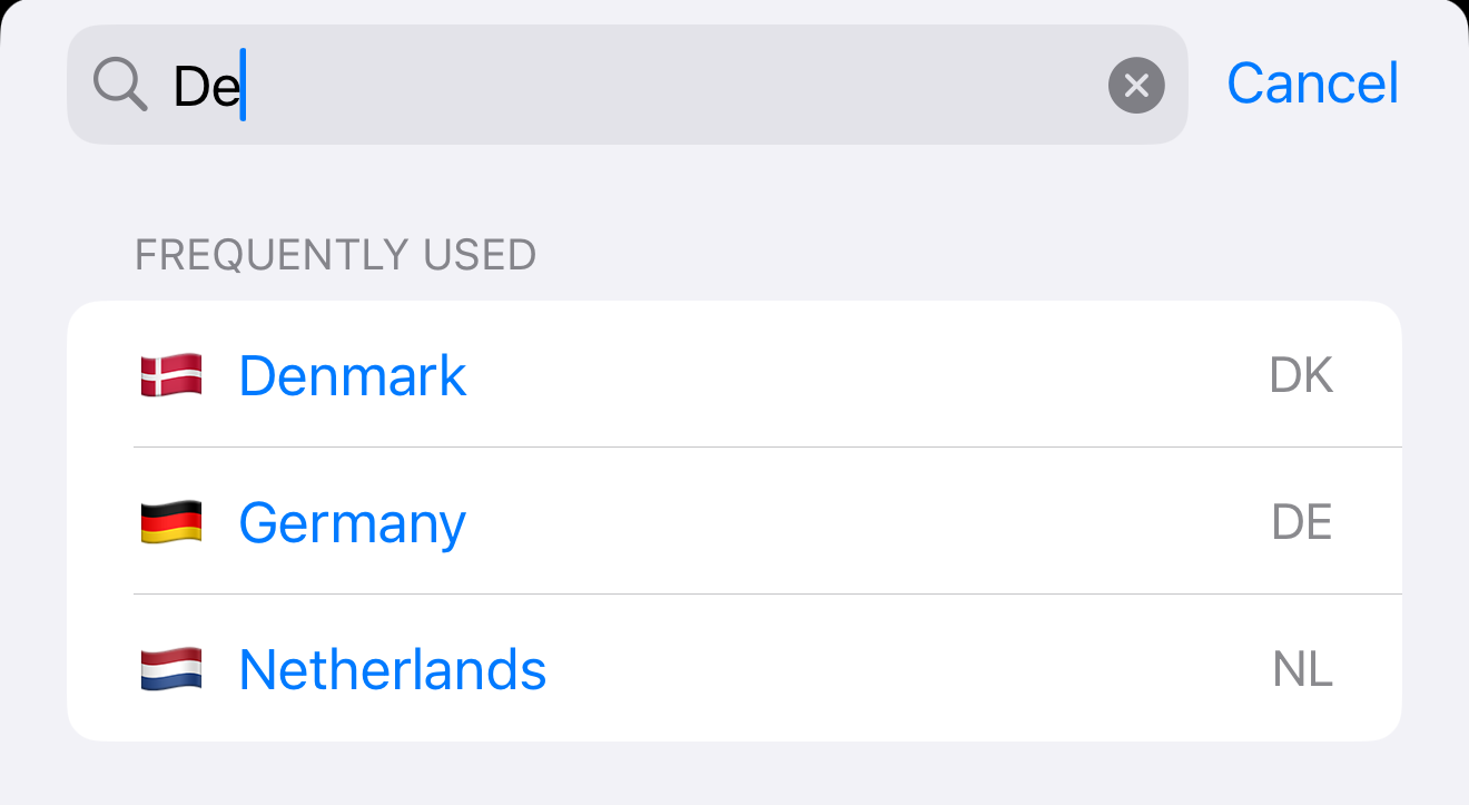
This means that if I search for De it will match the following cases:
Denmarkfrom the English country name “Denmark”Germanyfrom the German name “Deutschland”Netherlandsfrom the Dutch name “Nederland”
Alcohol percentage
Another feature that was requested in user feedback was the ability to specify the alcohol percentage (ABV) for each beer. This was a really great suggestion! Next to the Style field there is now a new Alcohol % field.

This field also has some features:
- It allows entry of percentages between 0 and 100 percent. Any value entered is automatically rounded up/down into this range.
- The input is sanitized, so any other input (for instance text) is removed automatically.
- Percentages can have one digit behind the decimal point. If you enter more, the value will be rounded to the nearest decimal.
- If you don’t want to specify a percentage, just leave it empty.
In version 2.3 I initially used a circular slider view but this proved to be a bit difficult and inefficient to use. Some more details on this can be found here.
Import/export format
These two new fields mean that the import/export JSON specification for the app has changed. The page detailing this has been updated and can be found here.
Implementation notes
Feel free to skip this section if you’re not that technical 🤓
What happened to versions 2.3, 2.3.1 and 2.3.2?
You might have noticed the release post has skipped some versions. This is quite easy to explain:
- Version 2.3 was released using a circular percentage selector (see section below). This proved to be visually appealing but not very friendly to use in practice.
- Version 2.3.1 therefore switched the percentage to a regular text input field. However, it had a non-destructive display grouping bug! 🐛
- Version 2.3.2 was then released as a revert, it was basically version 2.3 uploaded again with a new version number. This gave me some time to bugfix the issue from 2.3.1 without annoying users.
- Version 2.3.3 was finally released after some time with a proper working text field for percentages and proper display grouping.
Circular Percentage selector
When adding the percentage feature, I thought it was a good idea to come up with a custom solution to set this value in a fun way. I ended up with a circular slider view that looks like this:

I used ChatGPT as an experiment for this but in the end it basically served me up a more buggy version of this solution so I ended up using that as a starting point instead.
The fun part for me was getting this to work properly and also the haptic feedback the component generates when sliding around the circle. However after some user feedback (and using the feature myself in my actual production app) I realised this solution was tiresome and inefficient. The slider was quite sensitive and selecting the correct percentage value took too much effort.
So I removed the circular slider and reverted back to a TextField but if you’re curious, you can download the SwiftUI source file here. Feel free to use it in your own projects if it suits your needs.
Fixed view height
When adding the new fields I thought it would be nice to add them on the same line as the existing brewery / style fields. So I wrapped each line in an HStack. The downside of this is that my existing auto-complete solution for TextField (see screenshot below) would increase the height of the HStack. This meant that the country / alcohol percentage fields would also increase in height and that looked ugly in my opinion.
So my solution was to find a way to tell SwiftUI that a specific View should not grow in height after the initial layout. Something like this (note the ‘Alcohol’ field height):

The most simple solution would be to use .frame(height: X) but that overrides any automatic layout and is very brittle. The most ideal solution would be to read the height of the View after layout is finished and save it as a constant to use later on. So I ended up with this:
1
2
3
4
5
6
7
8
9
10
11
12
13
14
15
16
17
18
19
20
21
22
23
24
/// Reads the height of a view so that it can be used somewhere else
struct ViewHeightReader: ViewModifier {
    @Binding var height: CGFloat?

    func body(content: Content) -> some View {
        content
            .background(
                GeometryReader { geometry in
                    Color.clear
                        .onAppear {
                            if height == nil {
                                height = geometry.size.height
                            }
                        }
                }
            )
    }
}

extension View {
    func readHeight(into height: Binding<CGFloat?>) -> some View {
        self.modifier(ViewHeightReader(height: height))
    }
}
You can also download the Swift source for the extension here.
This extension reads the height of a view once (using onAppear) and stores it in a variable. It’s used like this:
1
2
3
4
5
6
7
8
9
10
11
12
13
14
15
16
17
18
19
struct DetailView: View {

    /// Height of the blue rectangle, used to apply fixed height to yellow rectangle
    @State var initialBlueRectangleHeight: CGFloat?

    var body: some View {
        HStack(alignment: .top) {
            // Let's assume this rectangle will change height at some point
            Rectangle()
                .fill(Color.blue)
                .readHeight(into: $initialBlueRectangleHeight)

            // This view should always have the initial height of the blue rectangle
            Rectangle()
                .fill(Color.yellow)
                .frame(height: initialBlueRectangleHeight)
        }
    }
}
This solution works fine for now, even though I think the design of this part of the app might need a bit of updating. Probably the .popover modifier would be a better fit for the auto complete suggestions.